Hi - Well I'm more shocked thank anyone.... I've managed to finish another project and blog post in 1 week!
So I love the work of a fab artist called Tiare Smith and now she's running a group on Facebook called Embrace Your Art. This weeks prompt was your name and the challenge was to use a wet wipe. I'd already decided to use an old vinyl record as she's using round pages and that just sprang to mind when Tiare called it a Jam!
As you'd imagine, I'd never journaled on vinyl before! It isn't the easiest surface to work on but a good gesso like the DecoArt brand should do the trick. Here is the finished project....along with several others that I did and then went over to reach the finished one!

Here you will find tutorials of my favourite projects; handmade and up-cycled along with lists of my classes in mixed media, papercrafts, painting, creative hand embroidery and jewellery making
Tuesday, 5 January 2016

Sunday, 3 January 2016
Wanderlust week 1

In the build up to Wanderlust I also signed up to another two art journaling groups. Journal 52 on Facebook and Embrace Your Art with Tiare Smith.Tiare . There Taire is using ROUND pages. In a moment of inspiration (madness) I decided to use some of the old, unloved vinyl Albums gathering dust in my loft - the products of a hubby who was a part time DJ for many years back in the day of real records! That meant I would be having a heap of album covers and the funky sleeves to use up to - so they will be my journals. And here is how I've used the first one!


A TRIBUTE album to Abba - of course I wouldn't have used a real Abba original! Gesso on that then I went wild with the DecoArt media misters. They are permanent when dry so brill for this kind of thing.


I cut them out and used DecoArt Decoupage Matte glue to stick them all onto my spritzed album cover, applying the glue both to the substrate and the shapes. Worked a treat!


Thursday, 31 December 2015
New Year Journal page
It's been ages since I blogged...and ages since I crafted just for fun! Here's how it happened. I was shopping in Kingston Upon Thames yesterday. So where did I end up??? In the kids shop! There is a fab children's shop called Smiggle which mainly sells all sorts of vibrantly coloured stationary and suchlike. I was looking for bits for my Mum's birthday next week as she's taken up colouring, when I spotted a set of crayons which looked remarkably like Gelatos - and they were all metallic and only a tenner!!! The lovely girl opened a pack for me to have a little play with and after that I was hooked. I've got lots of Gelatos, love the vibrant colours, but as these were all sparkly! I've missed journaling. And having been looking at the Journal 52 group and all the changes, having signed up to Tiare Smith's free Jam 2016 group and also the Wunderlust 2016, I thought I'd better have a quick play and what better topic today (New Year's Eve) than to say Happy New Year 2016!!
So here is the finished page. I simpley squished a load of the new crayons onto my journal page, spritzed, smudged and repeated.I then drew rough hearts again just using the crayons, layered and smudged shadows. Then I drew in the words with a Faber Castell Pitt marker, widened them, let them dry, then decorated each with white dots using a Signo Uniball white pen 153 (my fave of all white pens). And voilla.
Happy New Year
Hope yours is the best it can possibly be.
Suz
xxx
So here is the finished page. I simpley squished a load of the new crayons onto my journal page, spritzed, smudged and repeated.I then drew rough hearts again just using the crayons, layered and smudged shadows. Then I drew in the words with a Faber Castell Pitt marker, widened them, let them dry, then decorated each with white dots using a Signo Uniball white pen 153 (my fave of all white pens). And voilla.
Happy New Year
Hope yours is the best it can possibly be.
Suz
xxx
Friday, 11 September 2015
From tatty storage box to pretty bathroom furniture
We've had this storage box for many years and it had almost become invisible. But now I'm addicted to upcycling with DecoArt paints I find myself hunting around the house - and anywhere else I am - looking for things to give a new lease of life. And I was so pleased with the end result that the box now sits in my bathroom being very useful storing loo rolls and cleaning products while looking lovely!


Initially I was just going to use the Heirloom and Lace colours.


But I noticed on the DecoArt website how many colour variants you can make by mixing the ones you have....and I have a few!! So I thought I'd try blending a few colours to see what happened. I got the rich dark chocolate by mixing 3 parts Rustic Brown with 1 part Carbon Black...Loved it!

Hubby very kindly removed the box lid by taking off the hinges and arms that brace to keep the lid up. I gave the whole box/ lid a coat of the Lace then secured the Classic Quatrefoil stencil to the front of the box using a low tack tape so I didn't damage the first coat of paint and to mask of the areas I wanted to protect.

I started from the centre and worked my way out using the sponge dabbers which I find are a lot easier to use than stencil brushes, give a better colour blend and you don't have to 'pounce' quite so hard either. Starting with the lace in the middle I then added a darker colour each time until the darkest colour which I'd mixed myself, just in the corners.


And Voila!!!!
Here are a variety of pics in various lighting which I hope show it well.
Go on, have a go!!!


Feel free to leave a comment if you'd like to ask a question or just want to know more!
Have a good weekend all. Suz xxx
Thursday, 30 July 2015
Rescued Table painted with DecoArt Chalky Finish Paints
I am AMAZED by what people want to throw away! I hope this proves why we shouldn't be so wasteful.
I took this beaten up but SOLID table. Sanded down the top to remove thick paint splashes. Washed it completely....3 times as it was really filthy. I wanted to keep the original brass fittings underneath clean and also the markings underneath so taped all edges of areas I wanted to protect before starting .


Originally I was going to paint it a range of colours as you can see from the product pic. But I decided to keep it simple and elegant so I could use the table in my hallway and just went for two beautiful colours colours: white (Everlasting) and pale blue (Serene).
 To start with I painted the shelf white (Everlasting) to give a lovely contrast. Then painted the rest in the the serene. gave both a second coat being really careful where the legs cut into the shelf. Then I used a DecoArt stencil called Distress Harlequin which is one of the Chalky Finish range of stencils. I did this using a stencil brush and more of the everlasting paint and I was chuffed to bits with the results!
Once it was all completely dry I gave it a coating of the DecoArt wax cream to seal and protect it.
Why not have a go!
Suz
xxx


I took this beaten up but SOLID table. Sanded down the top to remove thick paint splashes. Washed it completely....3 times as it was really filthy. I wanted to keep the original brass fittings underneath clean and also the markings underneath so taped all edges of areas I wanted to protect before starting .


Originally I was going to paint it a range of colours as you can see from the product pic. But I decided to keep it simple and elegant so I could use the table in my hallway and just went for two beautiful colours colours: white (Everlasting) and pale blue (Serene).
 To start with I painted the shelf white (Everlasting) to give a lovely contrast. Then painted the rest in the the serene. gave both a second coat being really careful where the legs cut into the shelf. Then I used a DecoArt stencil called Distress Harlequin which is one of the Chalky Finish range of stencils. I did this using a stencil brush and more of the everlasting paint and I was chuffed to bits with the results!
Once it was all completely dry I gave it a coating of the DecoArt wax cream to seal and protect it.
Why not have a go!
Suz
xxx
Tuesday, 28 July 2015
Fairy Door using DecoArt media acrylic products
Some time last year we had to cut down a rogue young tree growing by the back fence in our garden (don't worry we've got a forest growing up there and they were crowding each other out!). I asked hubby to try and get some cross sections of the tree trunk so I could use them to craft with....I didn't know how, but loved the idea of it.


Anyway I've got a bit of a thing about doors at the moment, having seen some amazing examples at Westminster Abbey in London a few weeks ago. And while having my usual brows through some pics on Pinterest I saw a new trend developing in 'Gnome Doors'. Well I'd rather have a fairy in my garden and it seemed the prefect way to use on of the slices of wood. It was very easy too so here's how I made it

The wood slice was REALLY uneven as you can see from the pics. I spread a thick layer of DecoArt Crackle Paste to even out the surface, but this still left a fab texture underneath as this paste doesn't level like the Crackle PAINT does. These pics show how much I used; like icing a cake. It took a few hours to dry as it was soooo thick, but the unevenness of the layer gave great variations in the size of cracks!


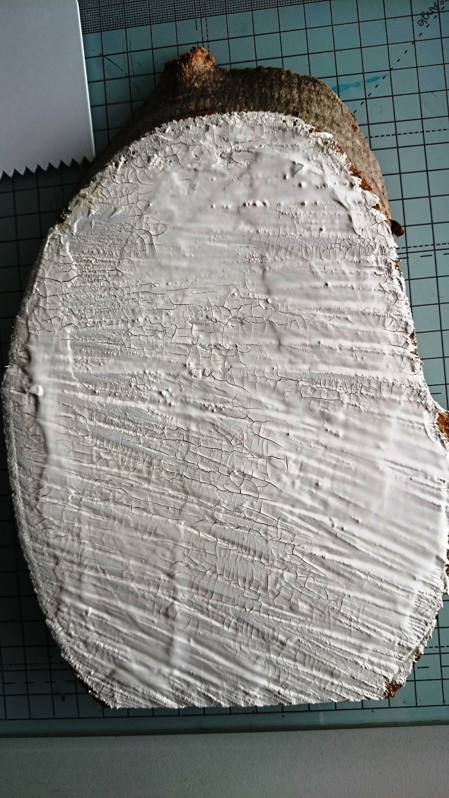
Once the crackle paste was dry I added antiquing cream in the patina and raw umber and a touch of white to emphasis the cracks and add colour. I left this a couple of hours then knocked it back with a damp cloth so it left a beautiful soft effect.


Then I added some gold metallic paint and also some gold Interference Acrylic paint. The first gave a more opaque gold which I smooshed into some of the cracks and wiped off the surface. The interference gave a beautiful sheen when it caught the light. I also then added some other interference paint in the magenta which you can just see flashes of!


So those couple of pics of the fairy door at the top were taken in my studio against the wall with a daisy chain over the top made from punched paper and glamour dust glitter. The other pic was by a redwood tree-trunk in Claremont Gardens.....these fairies like to travel you know and by moving the door they can go anywhere!
Hope you have fun making yours! Suz
Thursday, 2 July 2015
Fern (the Fairy) challenging myself to paint a face!
Hi all
I love drawing faces....but I'm really not good at colouring them in! I Drew this face a couple of months ago on a page which I'd used to mop up paints from another project (as you do).
Anyway I decided to try and paint Fairy Fern's face!
Oh my goodness; I ended up making so many mistakes and with so many layers it was hilarious. But I kept going (even through the part where I completely messed up her hair and made her look like 'Wolverine' ) until I had a face I as fairly happy with - then I made myself stop before I messed it up again! I'm really glad I had a go.
Oh my goodness; I ended up making so many mistakes and with so many layers it was hilarious. But I kept going (even through the part where I completely messed up her hair and made her look like 'Wolverine' ) until I had a face I as fairly happy with - then I made myself stop before I messed it up again! I'm really glad I had a go.
Here are pics of the stages and details of the beautiful DecoArt Media Acrylic paints I used.

 Here was the original sketch on a base journal page...I really liked it, very scared to paint it!
Hair and face were a mixture of Titan Buff and Quinacridone Gold; but just a touch of buff mixed with the quin G for the hair and the reverse for the skintone.

Lips were painted magenta and titanium white with a few white highlights.

Then I started on the eyes. I liked the colour behind the eyes and it was again very similar to the colour I'd achieved with the buff and quin gold during the process of playing with hair colours.
So I added the white then fIIled in with the gold/hazel colour where needed and added tiny black lines in the iris' and for the lashes and lids. Once the eyed were dry I added a couple of dots of Titanium white to bring them to life a little.
I went back over the hair using just quin gold,I kept adding depth with more colour (burnt umber and burnt sienna).

 So this was the beginning of "Wolverine recovery"! Basically taking the hair back with Titan Buff. But then I had to repaint the whole face again to get another even skin tone and it wasn't as nice as before (but it was ok!).
To paint the fairy wings I added Titanium White using quite heavy brush strokes for texture. Then I 'dripped and tipped' with a very water Cerulean Blue to create the veined look of the fairy wings.
I used the left over blue to fill in gaps around the edge of the page and to frame the top section.
The leaf was several layers of paint again to give a bit of depth. Mixing PhthaloGreen-Blue, Green Gold, Prussion Blue Hue and Titanium white
Handwritten words added with Decoupage glue and Voilla! Little old Fern is as ready as she'll ever be!
Good luck with projects you're not sure about - the moral of the story is KEEP GOING!
Have fun
Suz
x
Subscribe to:
Posts (Atom)