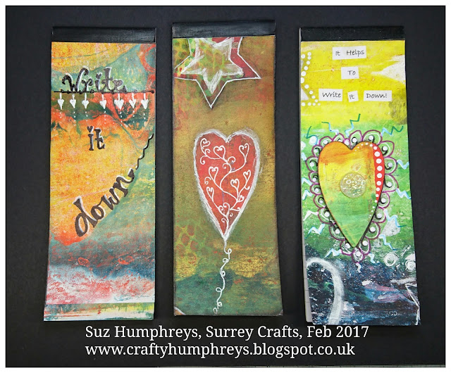
My little crafting world....


Hi all
I'm a complete craft addict! I have a small business called Surrey Crafts teaching craft workshops from my studio in Esher, Surrey and at venues around the country. I teach mixed media, decorative painting, card making and papercrafts, jewellery making and creative embroidery classes. If you'd like to find out more just leave a comment, or take a look at my other social media pages:
Facebook: https://www.facebook.com/surrey.crafts
Instagram: https://www.instagram.com/surreycrafts/
Pinterest: https://www.pinterest.co.uk/surreycrafts/
Crafty hugs & stuff
Suz

xx

Friday, 29 September 2017

Topsy Toadstool with DecoArt Media products

I was asked by a lovely friend of mine Angela Dearlove, if I would like to decorate this pretty fairy house storage box.  She hopes to be showing it as part of a new range she is launching TODAY on Hochanda at (4pm on the 29th September, look out for Polly Allsorts. Her range with it's beautiful assortment of styles and sizes is called 'Polly's Whimsical Houses!). I loved the look and clever concept so no hesitation on my part! I couldn't make up the storage section to show you here as I was posting it back to Angela to take to the show, so I can't wait to see how it looks all made up. Anyway, I had a play and really enjoyed it, so here's the pre construction project and a step by step....
The finished door, on "The Topsy Toadstool".
 
Here's the original piece. So cute, so much potential and this is actually the working door hinged onto a generous box with a shelf that you can't see in the picture.

I gave each of the panels a coat of DecoArt Chalky Finish paint in 'Lace' on both sides. Once dry I rubbed down lightly with sandpaper. To add faux brickwork to various areas on the door and walls, I used DecoArt Modeling paste through a stencil and once it was dry, another coat of the chalky finish paint.


A very diluted wash of DecoArt Media fluid acrylics next. Firstly in paynes grey, this  gives a lovely depth to the bricks.

Then a wash of Burnt Umber. Repeat washes until you like the colour, dabbing off with kitchen towel to remove any drips and create variation of colour and texture.

How the washes of colour look once all done.
I painted the cute little door red, and the roof too, again using chalky finish paint in in Rouge. But then added a little shading using an angled brush to apply Burnt Umber...I love how that brings out the detail on the door and roof and adds an 'aged' feel to them (look at the main pic below).

To add a shimmer and highlights to the brickwork, I added some DecoArt Metallic Lustre in Champagne by using it as a watercolour paint.

I also wanted to bring out the curves of the roof, so added a generous amount of the lustre along the lines.


And once all the shimmer was on, I wiped it back to be a little more subtle. I also added it to the door knob which made it really stand out.

To give this pretty, rustic house a little country cottage feel I then used some of the techniqes I've learned through 'You Can Folk It' who are also regulars on Hochanda to add flowers around the door frame and wall. Colours used were Pyrol Red, Dioxazine purple, and green, all mixed in various ways with titanium white.

Friday, 30 June 2017

Rescued Fossil Table

A year ago we had to take some bits to our local dump and recycle centre. While we were there I notice a sturdy little table had been thrown into the huge metal general rubbish container. It looked like there was nothing wrong with it! Because the container was almost full, I could just reach it. So pulled it out, had a look and knew I could do something with it.

Finally, after a year of sitting around (along with so many other potential projects!), I got it out and started to play. Here's how it ended up!


And this is where it started.
Two of the edges had some damage so I used texture past to even them up (not shown here). Once dry I painted the whole table top with Chalky Finish Vintage.

I added a thick layer of Crackle Medium and let that dry overnight.

I painted over with Eternal Chalky Finish (white). The cracks were fantastic!

Using Andy Skinner's lush Fossil Stencil with DecoArt Modeling Paste, I added fossils over the top of the crackle, turning the stencil over to get the spiral going in different directions (beware some stencils are best only used one way up).  Again leaving to dry well.

Next, lots of layering with Media Fluid Acrylics. I love the translucency of these and watered all of them down to make washes of colour. Yellow Iron Oxide to start.

Prussian Blue Hue. And you can still hardly see the fossils!

Quinacridone Violet, and a teensy bit of Dioxazine Purple. The shapes are finally appearing.

I repeated layer after layer of colour washes, concentrating the darker colours (less diluted washes) around the fossils to make them stand out.
I added a mixture of the Yellow Iron Oxide, some Raw Umber and a tiny bit of the Quin Violet to give a rusty edge and dabs in a few areas.

At this point, once I was happy with the base colours, I added a layer of Decoart Soft Touch Varnish. That way I sealed the paints before going onto the next step - and it would make it easier to wipe off the next layer if I didn't like it!

And guess what? Yup, I didn't like the next step, hahaaa. Apologies for the pic, it was getting dark! I'd added White Antiquing Cream to make the fossils pop even more but I wasn't happy so wiped it off again but some still remained as just soooo many little crevices!

So then it got really interesting! I Popped the stencil back over each of the shapes, took a sponge dauber and lightly added a little bit of Extreme Sheen in Tin to the inside edges and Extreme Sheen Antique Bronze to the outside edges of the spiral fossil shape, blending after both colours were applied.


I Loved the effect when the light catches it! But still not finished!

To add a little more depth I went back to the Antiquing Cream, adding Carbon Black and Raw Umber (to soften the black) around the fossils. Left these to dry and wiped back, blending a little of the cream across the table,  getting rid of most of the white.
Getting there! 
The final steps to finish of this fab little table were to go back over the fossils through the stencil again, dabbing another three colours of metallic paints, in Splendid Gold, Oyster Pearl and my fav of all, the lush Copper. I added just the smallest amounts so that each section of the fossil would have a different blend of metallic colours and I didn't obliterate the metallic colours underneath.  Each bit looked different as the 'bones' caught the light.


A little more metallic around all the edges of the table and she's finished at last!
I really hope you like my little rescued tabletable! Here is a (not very good) pic of the products used. 
Drop me a comment if you have any 
questions.
Thanks for looking.
Suz
x

Sunday, 21 May 2017

Dennis the Dragon


And here is finished Dennis the Dragon...a bit buckled, after all he is only on a bit of scrap cardboard, and I used a lot of wet products and watery washes. Maybe I'll have a go again some time on canvas.
Thanks for looking.
Suz
xxx


So at long last Dennis the Dragon is finished. And here's how I made him.


Just for a bit of fun one day, I grabbed a scrap piece of cardboard and started sketching a dinosaur head, as you do.
I applied crackle paint and sculpted it inside my sketch line using a pallet knife.
Once dry I started washing colour over him, but his skin was a bit thin in places, I wanted more texture, depth and crackle.  So  I applied a second layer in areas where it was too thin (and so very tiny crackles).
This dried leaving a brill 3D effect of big peeling cracks which were prefect for Dennis.
I applied washes of watered down Yellow Iron Oxide, touches of diluted Quinacridone(Quin)Gold, Quin Red and Quin Burnt Orange and Sap Green.  Once dry I began to wash over again with Prussian Blue Hue.

To sculpt his horns and eye,I used a pallet knife and white modelling paste and a dotting tool.

I Painted the whole background with white Gesso, then with a mixture of the red and gold paints used in step 1.

I applied Carbon Black paint to his horns. Then a mixture of red, gold, black and white to his eye. I also added more gold highlights to the fiery background and touches to the horns.

To give his eye a glassy look and add dimension I added liquid glass.

I worked on his eye a bit more, adding more crackle, and some then began working on the horns, adding PVA glue to start with (see info further down about what else I added to the glue).I also gave him some sparkly knashers to bite with....


Around his horns I added Cosmic Shimmer Glue, then Stampendous  Aged Ochre and Spice embossing enamels and melted them with a heat gun. When you heat this glue it bubbles up ad gives a texture I love, especially when melting embossing powders, etc to it! Some specks got onto other areas, I was fine with that.


And here is finished Dennis the Dragon...a bit buckled, after all he is only on a bit of scrap cardboard, and I used a lot of wet products and watery washes. Maybe I'll have a go again some time on canvas.
Thanks for looking.
Suz
xxx


Saturday, 11 February 2017

Gelli Plate prints: how to make them, how to decorate them, and how to use them!


Last November I ran gelli plate printing sessions at the Ministry of Mixology retreat in Coventry. They were super fast sessions, great fun with brill people.
I then had the chance to borrow the plates so that I could run a charity art event last weekend. That turned out to be an amazing day, with the most kind and generous people, with wonderful sponsors and donations from my fantastic crafty friends.  By mid day today, including match funding of £350, they helped me to  raised a total of £1191! I promised a blog post, so here it is!
How to make the prints, how to doodle on them, and how you can use them. Enjoy - and please leave a comment.
Suz xxx
Samples of the heart prints
 Samples of the plain ghost prints
Samples of the star prints we made at Mixology - same principles as below,  just different shapes and colours
 Samples of the sunset prints made at the charity Art Event
Samples of the flower prints we would have ade at the charity event ....if we'd had time!
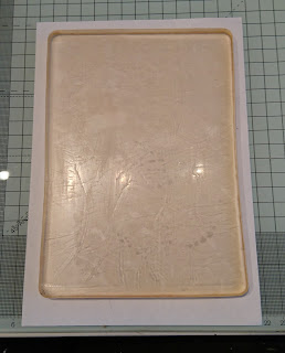
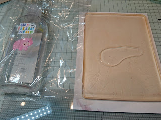
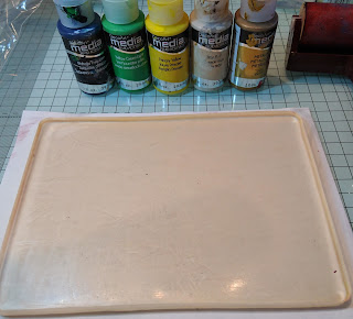
Add Place a piece of white paper larger than your plate, underneath the plate. This will help you line up all your prints so you end up with your paints focused in the same area.


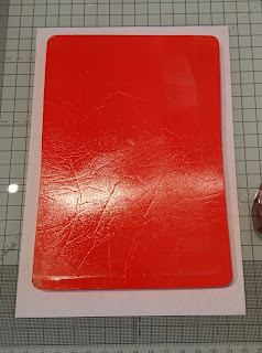
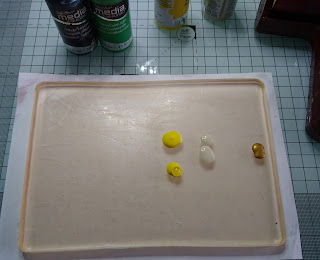
You'll need just 5 drops of red directly onto your plate. Brayer so that it covers the whole of the plate.
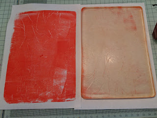
Take a clean piece of paper and place it on top of the plate, lining up the top edge with the edge of the paper underneath your plate. Smooth over the back of the paper and pull the print away from the plate.This pic shows the pulled red print is a bit patchy. If you want a really intense colour, repeat the process as I did (see deeper colour in next pic) or roll off the excess paint from your brayer over the top.

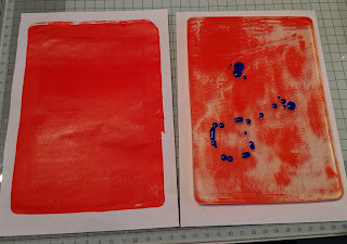
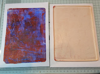
One way to clean off the plate, if you have quite a bit of paint left on it as there was in the far right pic (taken after a second layer of red was applied ad pulled off), add a few drops of a contrasting colour to the plate, brayer over the whole plate, lay down a fresh piece of paper on top of the plate and pull a second print. This is called a ghost print as it pulls up what was left from the previous print.

This pic shows a ghost print with the red base
and the blue behind.
You'll see at the end of this post how
I used this print to make a lovely card.
Another way to clean off your plate is to wipe it with a
few drops of baby oil and some kitchen towel.
To make the heart print, turn the plate so that
it is landscape.

I worked from the right to left, as I'm right handed.
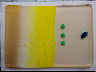
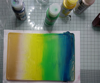
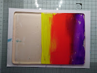
One drop of gold, 2 of Titan Buff, and 3 of Primary Yellow and brayer up and down to create a striped effect.
Once brayered, turn your plate 180 degrees so that you are still working on the same side no need to clean off the brayer, but you can if you wish, then add 3 dops green in the middle and one of Phthalo Turqoise at the end (I spritzed the Turquoise with water as it is such a strong colour,
and again brayer.


When you are adding paint, turning  and brayering,
you need to work quickly so the paint doesn't start to cry before the next step, spritz lightly with water if you need to extend the 'open time'. I then turned my plate back to a portrait position.

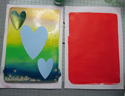
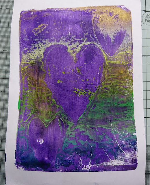
While the paint is still wet on the plate, pop down your paper shapes, (you could also use stencils) take your original red print (shown on the right) and place it face down onto the paint covered plate, on top of the shapes. Smooth down, or roll the brayer over the back
 (this would also clean off your brayer).
Where I've got a little baby oil residue, the spritzed paint 'puddled', but I like the effect. To avoid this make sure you wipe off all the oil, or don't spritz with water!
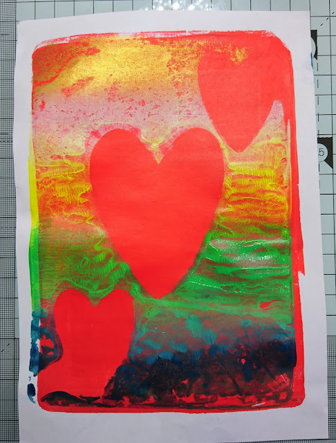
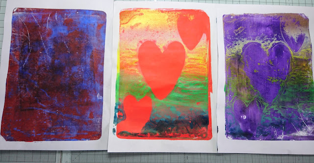
Pull off your print.  Don't worry if you have some 'undefined' areas, we'll doodle on them and make them look fab!

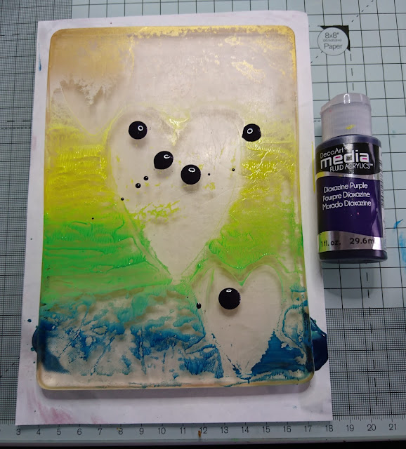
I worked a bit slowly because I was taking pics, so had a lot of paint left on the pale. So I took another 'ghost print' I used purple as my contrasting colour on the plate, brayered over the whole plate and pull off another print. Sometimes these make the BEST prints as they are so unpredictable and interesting!Remember to line up your paper with the sheet under your plate so your paint lays in the same area.

Here's how the ghost print turned out - love it! And it'll be even better once I've doodled! Again see further down the post how I used this one too for another lovely card!

 Main print and ghost print with the start of penwork
I then used paint, a dotting tool, pens, charcoal and various shaped lids to decorate and doodle on the prints.
This bit is soooo much fun!

All Done for now for now - lets move onto the sunset.
 
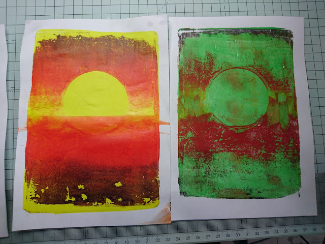
To make the sunset, repeat the first steps used for the red  print above, but using the primary yellow instead of the red.
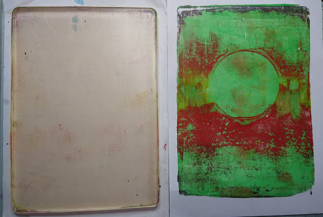
For the second layer of the sunset, again turn the plate to work with it landscape, have your yellow print ready and a die cut circle shape. working from one side towards the middle, take 1 drop of the purple, 2 of the red and 3 the of the yellow and brayer.
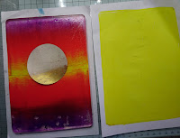
 Turn your plate right the way around again (180 degrees), so you are working on the bare side of the plate, and if you have enough paint left on your brayer, just brayer up and down again - creating an almost symmetrical look. Working quickly, lay down your circle shape just slightly higher than central. Take your yellow print, place it face down onto the wet plate (again lining up the top of the yellow print with the paper underneath the plate. Smooth the back of the paper so it soaks up all the paint, then pull away.
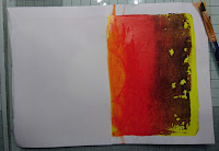
 You can see the print here on the left, and the plate with the paint residue.
Now take the print, place a piece of paper so that the straight edge is along the middle of the page (to create a horizon) and sweep a wet paintbrush across the straight edge of the paper, if the paint is still we it will spread it across the horizon- if the paint has already dried, use your wet brush to pick up some red/ yellow from either your brayer or the plate.

You can see here when I lifted away the straight edge of the white paper, the circle is now painted across the bottom creating a beautiful sunset pic to work on.
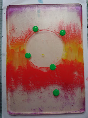


Now use up all that gorgeous residual paint by adding a few more drops of a contrasting colour, and pull another print.
And another fab background to work on,
and much less paint to clean off the plate
Here are some of the finished samples to show how you can use your lovely prints!
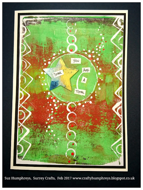
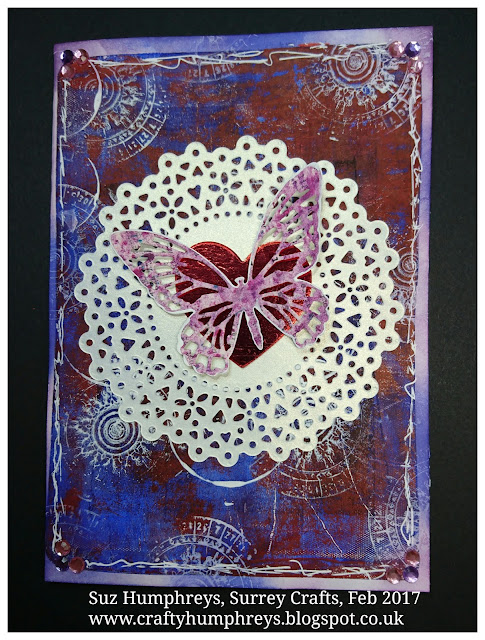
Here's the lush green ghost print, made into a congratulations card
Dodgy pic (sorry!) of a thank you card
from the first heart 'ghost print'.
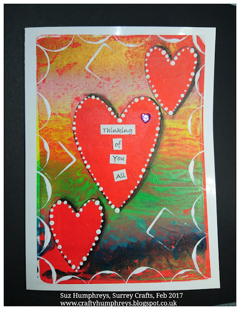
A card for a special pal and her family
using the main heart print.
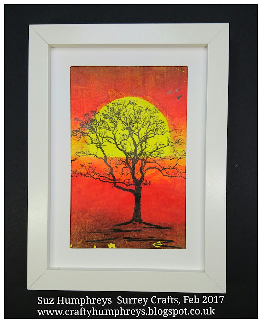
Here's how I used the sunset print -
great pressy for a friend who loves Africa
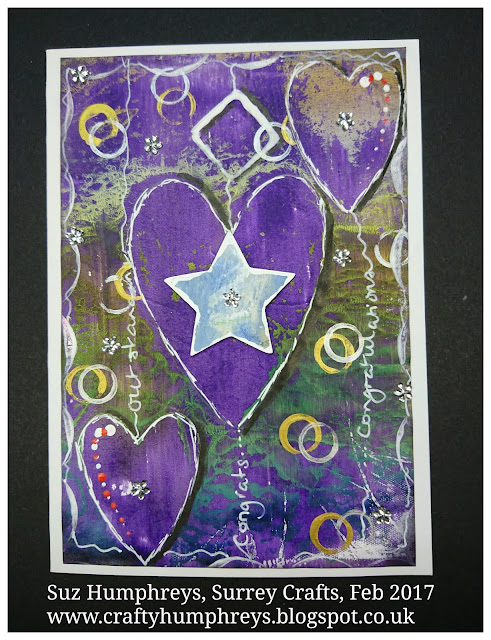
Here's how I used the purple 'ghost print' - to make a fab card to celebrate another friends achievements! I used a star shape which was a 'mask' shape from the star prints shown at the beginning of the post.
And here I cut up various spare prints
to decorate shopping list pads.
The main sunset and the ghost print before doodling


The main heart print and the two ghost prints
 
 I hope it gives you some ideas and that you'll have a go too!